If you want to display an outline in SwiftUI you may use the framework supplied OutlineGroup construct. That’s based on a nested tree of DisclosureGroup and is quite nice. But on appearance of the OutlineGroup all outlines are collapsed. Well, in one of my projects I wanted to display the outline all expanded on show up. No way to do that with OutlineGroup as far as I know. But then I found this nice variant (https://stackoverflow.com/questions/62832809/list-or-outlinegroup-expanded-by-default-in-swiftui) with a control of expansion:
|
1 2 3 4 5 6 7 8 9 10 11 12 13 14 15 16 17 18 19 20 21 22 23 24 |
struct NodeOutlineGroup<Node, Content>: View where Node: Hashable, Node: Identifiable, Content: View { let node: Node // the root node to display let childKeyPath: KeyPath<Node, [Node]?> // and the key path to its children @State var isExpanded: Bool = true // do we want to expand everything? let content: (Node) -> Content // and what to display on each node var body: some View { if let child = node[keyPath: childKeyPath], // we do have an array for children !child.isEmpty { // and its not empty DisclosureGroup( // show the node as a disclosure group isExpanded: $isExpanded, content: { if isExpanded { // the disclosure group is expanded ForEach(child) { childNode in // show the outline group for each child NodeOutlineGroup(node: childNode, childKeyPath: childKeyPath, isExpanded: isExpanded, content: content) } } }, label: { content(node) }) // the line to display for every node } else { content(node) // the node has no children, just show the line } } } |
Basically, it’s recreating the OutlineGroup with the additional parameter isExpanded. And, in my version, it’s displaying the leafs correctly if the child’s array is nil or it is empty.
 Today I need to select an item from an outline. It should behave very similar to the standard
 Picker in SwiftUI. But Picker does not accept an outline to pick from. So, we do have to invent that by ourself.
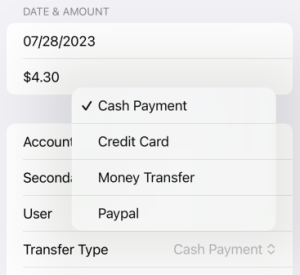
 On the left hand side you see my example app with the selection from a plain array with
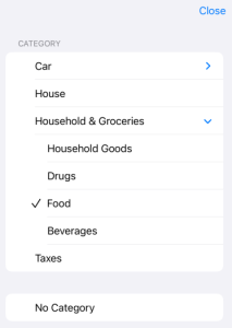
 Picker. And the same should work with an outline like here on the right hand side:
Looks nice, doesn’t it?
Here is the implementation of my OutlinePicker:
|
1 2 3 4 5 6 7 8 9 10 11 12 13 14 15 16 17 18 19 20 21 22 23 24 25 26 27 28 29 30 31 32 33 34 35 36 37 38 39 40 41 42 43 44 45 46 47 48 49 50 51 52 53 54 55 56 57 58 59 60 61 62 63 64 65 66 67 68 69 70 71 72 73 74 75 76 77 78 79 80 81 82 83 84 85 86 |
struct OutlinePicker<Node, Content>: View where Node: Hashable, Node: Identifiable, Content: View { let title: String // the title of the picker let nodes: [Node] // and the array of nodes to display let childKeyPath: KeyPath<Node, [Node]?> // and the key path to its children @State var isExpanded: Bool = true // do we want to expand everything? @Binding var selection: Node? // the selected node let content: (Node) -> Content // and what to display on each node @State private var showSheet = false // do we show the sheet? private let checkMarkWidth: CGFloat = 27 // the width of the checkmark symbol var body: some View { HStack { // make it similar to the standard picker Text(title) // display the title Spacer() // and the rest right aligned Button(action: { // the trigger for the popover showSheet = true // show the sheet }, label: { HStack { // display the current selection if let selected = selection { // we actually do have a selection content(selected) // display its content } else { // no, there is no selection Text("No " + title) // signal that } Image(systemName: "chevron.up.chevron.down") // indicate the picker .font(.footnote) // with the same size as the standard picker } }) .foregroundStyle(.secondary) // in gray } .sheet(isPresented: $showSheet) { // the sheet is triggered NavigationStack { Form { // show the outline in a list Section(content: { // the outline group as a section ForEach(nodes) { node in // for every node show the outline group NodeOutlineGroup(node: node, childKeyPath: childKeyPath, isExpanded: isExpanded, content: { n in Button(action: { // and make the content selectable selection = n // remember the selected node showSheet = false // and stop the sheet }, label: { HStack { // what do we want to display at each node if n == selection { // this node is the currently selected one Image(systemName: "checkmark") // signal that } else { // no, its not the currently selected one Spacer() // leave some room .frame(width: checkMarkWidth) // to make the columns left aligned } content(n) // and show the content of the node Spacer() // left aligned } }) .foregroundStyle(.primary) // in standard color }) } }, header: { Text(title) }) Button(action: { // and add the option for no selection selection = nil // signal that showSheet = false // and stop the sheet as well }, label: { // display that quite similar HStack { if selection == nil { // currently there is no selection Image(systemName: "checkmark") // signal that } else { // no, we do have a selection currenlty Spacer() // leave some room for the checkmark .frame(width: checkMarkWidth) // to make the columns left aligned } Text("No " + title) // the text of no selection Spacer() // left aligned } }) .foregroundStyle(.primary) // in standard color } .toolbar { ToolbarItem(placement: .topBarTrailing) { // top line Button("Close") { // add the close button showSheet = false // stop the selection } } } } } } } |
Yes, it’s a little bit lengthy. Let’s take a look in some more detail.
Lines 2 – 7 represent the parameters of our new construct:
- title: the title string of our
Picker - nodes: the array of Node which build the outline tree
- childKeyPath: the path to the array of child nodes
- isExpanded: the flag to control whether the outline is expanded on startup or not
- selection: the selected node on startup and dismissal
- content: the display of node
This will be used like this:
|
1 2 3 4 5 6 7 8 9 10 11 12 |
Picker("Transfer Type", selection: $type) { ForEach(types) { t in Text(t.name) } } OutlinePicker(title: "Category", nodes: categories, childKeyPath: \.subTags, isExpanded: false, selection: $category) { c in Text(c.name) } |
The first 5 lines show the usage of the standard Picker in my test app. And then my OutlinePicker follows. Looks quite similar, doesn’t it?